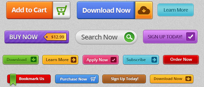
What is a call-to-action button?
Call-to-Action is an opportunity to take your visitors to a step forward to become a customer. Call-to-Action button is the most important part of a sales funnel. Many times a potential customer may be looking for an action to be performed after going through the site content & skipping the CTA is a grave mistake. The calls to action serve as a link between a visitor & a conversion.
Once visited the site, mostly, within 7 seconds the visitor decides whether to stay on the site or not hence it is important to design the CTA button considering the kind of people visiting your site and tailor the needs accordingly.
Where can I place the call-to-action button?
-
Use highly contrasting colors than surrounding colors such as red, blue, orange, yellow, pink & green.
-
CTA button size should be big enough so that it is eye-catching & quickly readable.
-
CTA button should look like it is clickable. While hovering different color and effects can be given to make it more attractive.

-
If there is a text above or beneath the button then it should have enough space between the buttons so that the button stands out.
-
Button shape can be either square or rounded.
-
Complementary border can be provided if needed.
-
Large texts should be provided for better visibility.
-
Call-To-Action button texts should be simple & effective.
-
Button should sense an urgency like join now, immediately, expires today etc.
-
Depending upon the requirement two CTA buttons can be placed , one for primary goal and the other for secondary. In this case the primary CTA button should be highlighted For example “Get Started” & “Contact Sales” as shown below.


Maryam Marjan K A
This article sure is quite informative. Thanks for sharing.